A visit to the sleepy historic conceptual art exhibition "Materializing SixYears" at the Brooklyn Museum afforded me the chance to look at artist Ed Ruscha's 1966 Every Building on the Sunset Strip, an accordion book that recorded in black-and-white photographs, with written labels identifying the housing blocks and businesses. I was thinking how fun it would be to give kids cameras on a neighborhood walk to discover our school community, and produce a similar book.
Sunday, October 14, 2012
Accordion Books
A visit to the sleepy historic conceptual art exhibition "Materializing SixYears" at the Brooklyn Museum afforded me the chance to look at artist Ed Ruscha's 1966 Every Building on the Sunset Strip, an accordion book that recorded in black-and-white photographs, with written labels identifying the housing blocks and businesses. I was thinking how fun it would be to give kids cameras on a neighborhood walk to discover our school community, and produce a similar book.
Friday, October 5, 2012
Reading Series Out of Order
One of the gifts to librarians that designers/publishers can give is to put the number of the series book on the spine of the book, so that we can tell what order the series should be read. How annoying it is to have to look at front or back matter to find a list, or--even more time consuming--to have to research where a single book fits in a series. If I can't determine where it fits by examining the book, I turn to the incredible Juvenile Series and Sequels database from Mid-Continent Public Library, where I can search by series title, book title, series subject, or book author.
How can one know if a book in a series can be read as a standalone book, without having read the titles that come before? My general policy is to read at least the first book in a popular series--but I don't feel compelled to read every single Magic Treehouse book (I get the idea...). I certainly don't want to give a kid Harry Potter and the Prisoner of Azkaban before s/he reads the Chamber of Secrets.
Some kids want to read the A-Z Mysteries or 39 Clues in order, regardless of whether it makes a difference (and it doesn't). But I'd love to have a way of knowing which series books must be read in order.
These books have no visible numbers on the jackets.
Which comes first? Does it matter?
Monday, October 1, 2012
Re-Dressing the Classics
How fortunate for me that the 2012 Kidlitosphere Conference was held here in NYC. On the agenda for was a pre-conference trip to Penguin publishers, where we heard from the editors of the various imprints, including Viking, Dutton, Putnam's, Philomel, and Razorbill. The icing on the cake was was the presentation by Penguin's art department, where they presented the process of designing the books' jackets. I hadn't realized that negotiating a final book cover can go through as many as 50 versions, before the team selects the "right" one?
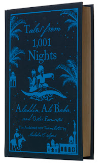
We--librarian/bloggers--were treated to a show-and-tell of classic titles that Penguin has enticingly repackaged. Printing classic titles is a relatively economical enterprise for publishers, on account of the texts' placement in the public domain. At a time when such titles are widely available for free in electronic format, the publisher must come up with a design that is so irresistible that one wants to own it in its physical form. Well, I'd say they have succeeded in making this reader covet some of them.
Here's a taste of the display (below):
Penguin Threads designed by Jillian Tamaki (some of which I featured here back in November 2011), were painstakingly embroidered by hand in prototype.
Penguin Ink (tattoo art style):
Clothbound childrens' classics re-outfitted by designer Coralee Bickford Smith:
The last specimens to be unveiled were the soon-to-be reissued children's classics, such as Pippi Longstocking and The Wizard of Oz, decked out in the bold signature chalkboard lettering by designer Dana Tanamachi. You must wait to see these--
We--librarian/bloggers--were treated to a show-and-tell of classic titles that Penguin has enticingly repackaged. Printing classic titles is a relatively economical enterprise for publishers, on account of the texts' placement in the public domain. At a time when such titles are widely available for free in electronic format, the publisher must come up with a design that is so irresistible that one wants to own it in its physical form. Well, I'd say they have succeeded in making this reader covet some of them.
Here's a taste of the display (below):
Penguin Threads designed by Jillian Tamaki (some of which I featured here back in November 2011), were painstakingly embroidered by hand in prototype.
Penguin Ink (tattoo art style):
 |
| Illus. Robert Ryan |
 |
| Illus. Jen Mumford |
Clothbound childrens' classics re-outfitted by designer Coralee Bickford Smith:
The last specimens to be unveiled were the soon-to-be reissued children's classics, such as Pippi Longstocking and The Wizard of Oz, decked out in the bold signature chalkboard lettering by designer Dana Tanamachi. You must wait to see these--
Subscribe to:
Comments (Atom)
.JPG)
.JPG)


